Dirty Metal, Homemade Bone, and Learning Contrasts
We love these hobby moments where someone drops photos into chat, says they are “terrible at this,” and then immediately shows something that already has a really strong vibe. That was exactly the case this time, when Staś shared two fresh painting shots and gave us a very honest progress report.
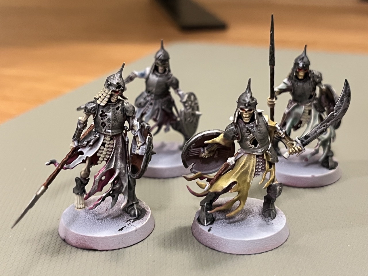
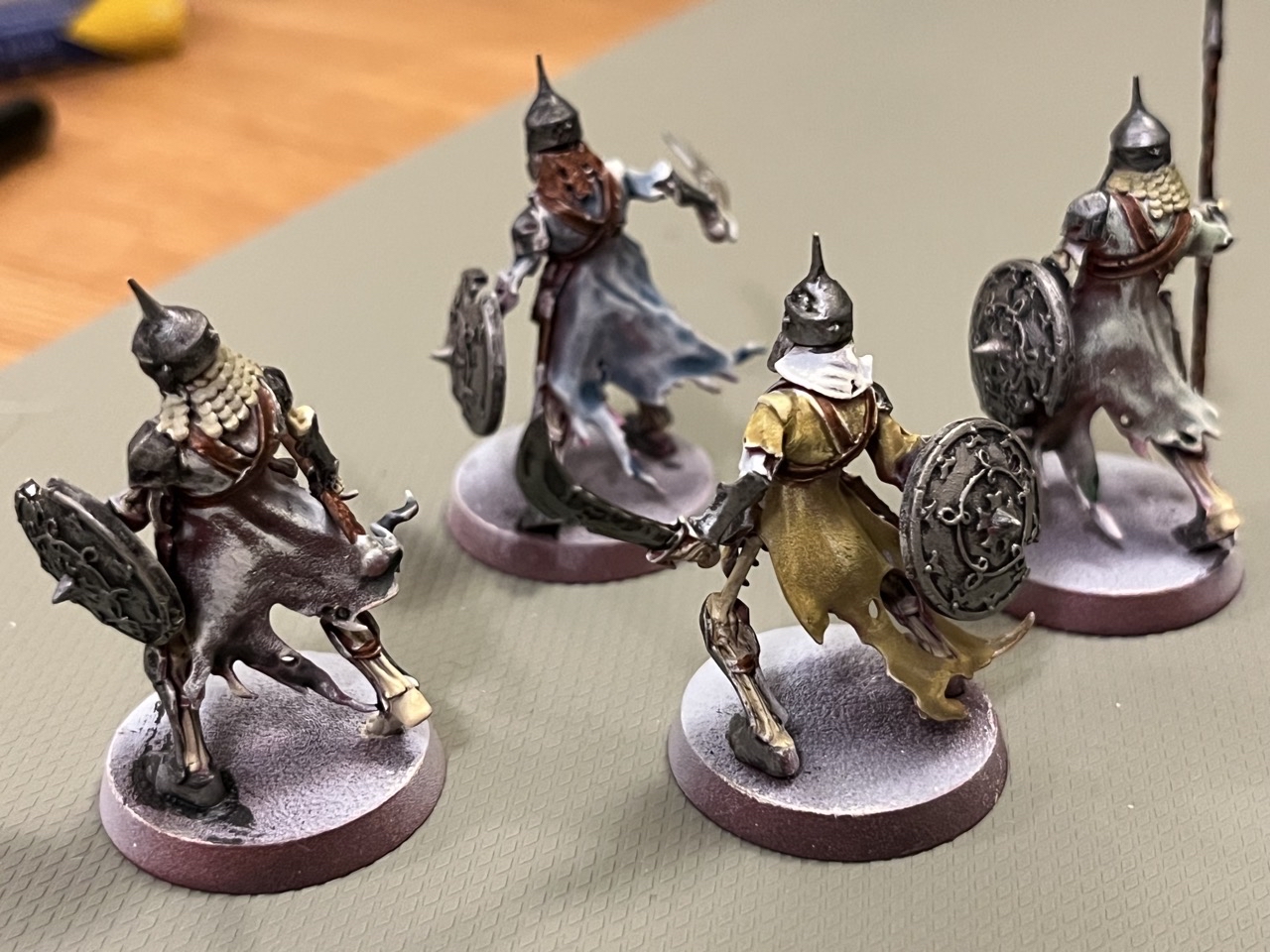
Staś was pretty hard on himself right away. In his own assessment, the overall result still leaves a lot to be desired, especially on the fabric. He had been experimenting with different cloth colours and trying out contrast-style paints, but the results felt inconsistent. Some combinations just did not work for him, while others covered too strongly and killed the effect he wanted.
He pointed out one specific example on the back of the miniature on the left: the colour more or less disappeared there, and the burgundy primer started showing through. Honestly, that kind of thing is frustrating, but it is also exactly the sort of issue that teaches us the most. Every painter has that phase of finding out which paints flow nicely, which ones stain too much, and which surfaces suddenly behave differently than expected.
The part Staś was happy with is also the part that immediately caught our eye: the dirty metal. And fair enough — it really works. It has that worn, grimy feel that is much harder to fake than clean armour. Instead of looking flat, it already feels used and lived-in, which is perfect for Warhammer miniatures.
The other win was the bone. Staś mixed the colour himself from white, yellow, and brown, and he was genuinely pleased with how it came out. We totally get why. There is something deeply satisfying about mixing a useful colour yourself and then realising you do not actually need to buy another pot just because the label says it is made for skeletons. In this case, that improvised recipe also came with a very important hobby victory: saving 14 złoty that would otherwise have gone on Skeleton Horde.
Michał’s reaction in chat was immediate and very relatable: he thought the result looked great. And that is worth mentioning, because hobby brain often zooms in on every weak spot while everyone else sees the overall effect first. From the outside, what stands out here is not “failed contrast” but a miniature that already has character, a nice dirty metallic finish, and a bone tone that looks natural.
The next planned step was simple: go out and get some gold paint. Which, to be honest, sounds like exactly the right move when a scheme is starting to come together and you can already see where a metallic accent might help tie it all up.
This is one of those updates we really enjoy sharing, because it captures what painting actually looks like in real life: part frustration, part experimentation, part accidental success, and a lot of figuring things out as we go. Sometimes the best colour on the model is the one we mixed ourselves, and sometimes the part we are most unsure about still looks great to everyone else.
If nothing else, this was a good reminder that “I am awful at this” and “the dirty metal came out quite well” can absolutely exist in the same painting session.