Drybrushing Over Black Primer: Fast Contrast Without the Guesswork
We recently had one of those very relatable hobby chats: frustration with paint ranges that look completely different in the bottle, on the chart, and on the miniature. This time it started with Vallejo catching some heat for confusing colour presentation, and quickly turned into a much more practical question: what does a miniature actually look like when most of the work is just drybrushing over black primer?
And honestly, that is a great question.
For a lot of us, especially when we want to get models on the table fast, the workflow is less about chasing perfect box-art smoothness and more about finding a method that is quick, readable, and forgiving. Drybrushing over black primer is exactly that.
The core idea
As Michał pointed out in the chat, the principle is very simple:
generally, all the raised areas are bright, and the recesses stay black
That is really the whole trick.
You start from a black undercoat, then build the model upward with drybrushing. The brush catches edges, textures, folds, armour panels, fur, chainmail, and other raised details, while the deeper parts remain dark. That gives you instant contrast and a surprisingly solid tabletop look with relatively little effort.
Why this works so well
The biggest strength of this method is that black primer does a lot of the heavy lifting for us.
- Recess shading is already there
- Missed spots are less obvious
- The miniature reads well from a distance
- It is fast enough for whole units
If we then add a wash or shade from Citadel, or pick a few colours from Army Painter on top, we can get a result that looks much more intentional than the time investment would suggest.
That also explains why this approach comes up so often when we are trying to solve the “how much coverage do I actually need?” problem. With drybrushing, the answer is often: less than you think.
What level of coverage are we aiming for?
The question in the conversation was specifically about coverage: how much of the black should still be visible?
The answer depends on the material and the look we want, but as a general rule:
- Top edges and raised surfaces should catch the most paint
- Mid-level areas should get a softer, partial pass
- Deep recesses should stay mostly black
So we are not trying to fully repaint the model in grey, bone, or whatever our drybrush colour is. We are trying to create a sketch of light.
If we go too heavy, the model starts to lose depth. If we go too light, it can look unfinished. The sweet spot is where the miniature already has readable shapes before we even start adding proper base colours.
The visual reference that kicked this off
Michał also shared the video that, in his words, “started it all” for this approach. That kind of hobby origin story always hits home, because most of us have that one tutorial that suddenly makes a technique click.
He also dropped a reference image showing the result and the logic behind it.
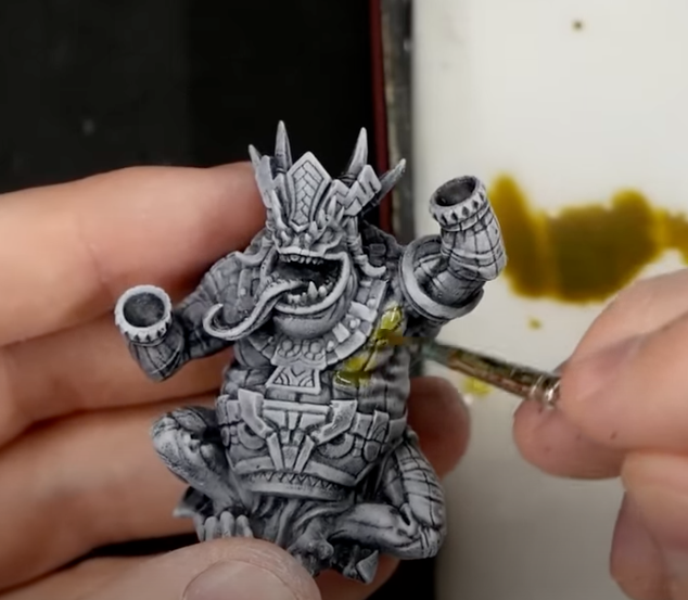
Even from a simple reference like this, the key takeaway is clear: the bright drybrush defines the form, while the black undercoat keeps the shadows strong.
A practical way we would approach it
If we were explaining this method to someone starting out, we would keep it simple:
- Prime the miniature black
- Drybrush with a mid-tone over the whole model
- Drybrush more lightly with a brighter tone on the upper and most exposed areas
- Add selective colours where needed
- Use a shade or wash to tie parts together if the transition feels too dusty or chalky
This is especially useful for textured miniatures, monsters, undead, terrain, cloaks, fur, and anything else with strong sculpted detail.
Paint ranges matter less than the method
The chat started with paint range frustration, and fair enough — bad colour representation online or on the bottle is annoying. But one nice thing about this drybrush-first workflow is that it is less dependent on choosing the one perfect paint from a chart.
If the structure is doing most of the work — black in the recesses, light on the raised parts — then even a slightly different tone than expected can still look great on the miniature.
That is probably the biggest hobby tip here: good contrast beats perfect paint selection surprisingly often.
Final thought
If you have ever looked at a black-primed model and wondered whether drybrushing alone can get you far enough, the answer is yes — definitely farther than it might seem at first.
It will not replace every technique, and it is not the answer for every style, but for getting miniatures battle-ready quickly, it is one of the most reliable tricks in the box.
And if nothing else, it is a very good antidote to staring at paint swatches and getting angry at colour charts.