Testing Metallics, Shades and Contrast on the Bench
A small painting test that turned into a useful comparison
Sometimes the best hobby posts come from a very ordinary evening at the painting desk. This time Stas was experimenting with a few different approaches: metallics with shade, some later highlight work, and a comparison with a more contrast-driven approach on small details.
Right at the start, there was also a very practical basing question: does static grass go on with normal glue? The short version from our side: yes, usually PVA/white glue works perfectly well for grass on bases. It gives you enough working time, holds nicely, and is probably the most common option for this kind of job.
Metallic + shade: a result we really liked
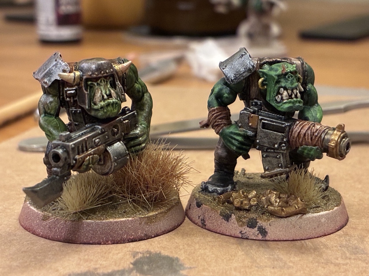
The first stage was a metallic surface finished with a shade, and honestly, the result already looked very solid. That combination has a lot going for it: it is quick, readable, and gives a nice sense of depth without too much effort.
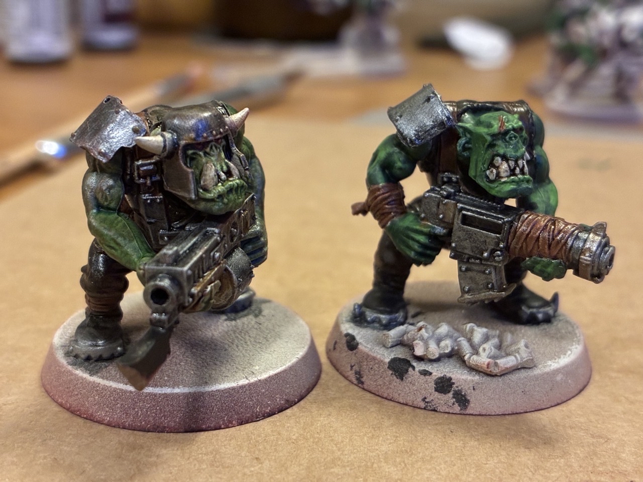
What we liked most in this stage was that it kept the surface under control. Shade over metallic can do a lot of work for you, especially when you want definition fast without immediately jumping into more advanced layering.
Then came the highlights
After that, Stas pushed the model on the right further with highlights. This time, though, the effect did not land quite as well as hoped. And honestly, that is such a normal part of painting that it is worth talking about.
Sometimes a model looks great at the basecoat + shade stage, and adding highlights does not automatically improve it. If the highlights are a bit too strong, placed awkwardly, or just not matching the texture and finish underneath, the miniature can lose some of the smoothness it had before.
We really appreciate this kind of honest hobby note, because it is exactly how progress works. Not every extra step is an upgrade, but every extra step teaches something.
Base + shade vs contrast/slapchop
The most interesting takeaway here was not really whether one method is universally better, but where each one shines.
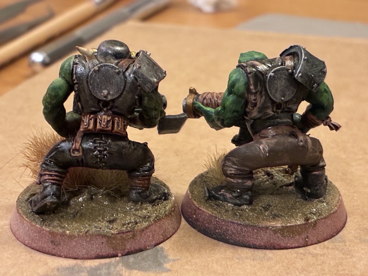
Stas mentioned that base + shade feels better overall, mostly because it gives more control and makes it easier to fix things after the fact. That makes a lot of sense. It is a comfortable workflow when you want to build the miniature in a deliberate way and keep room for corrections.
On the other hand, contrast paints really stood out on smaller details. On the last image, the three pouches on the belt of the model on the left were a great example of that “slapchop”-style payoff. On textured or sharply defined details like pouches, straps, folds and similar elements, contrast can settle beautifully and do a lot of the heavy lifting.
That is probably the most useful conclusion from this little test:
- base + shade gives better control and easier cleanup,
- contrast/slapchop can look fantastic on small, well-defined details,
- highlights are not always the automatic final improvement we want them to be.
The fun part: learning what to use where
We always like these moments because they move painting away from “which method is best?” and toward the much more helpful question: “which method is best for this part of the model?”
That is where hobby confidence really starts to grow. Not in blindly following one recipe, but in noticing that metallics plus shade may be enough in one area, while contrast is the better tool for belts and pouches, and highlights need a bit more care to actually improve the finish.
A very relatable little painting session, and a good reminder that even when something “didn’t go super,” it can still tell us a lot.