A Chaos Paint Scheme That Looks Suspiciously Orderly
We had a fun little painting discussion the other day when Michał dropped a Chaos scheme idea into chat and asked what we thought. The immediate reaction was pretty much: yeah, that actually looks really good.
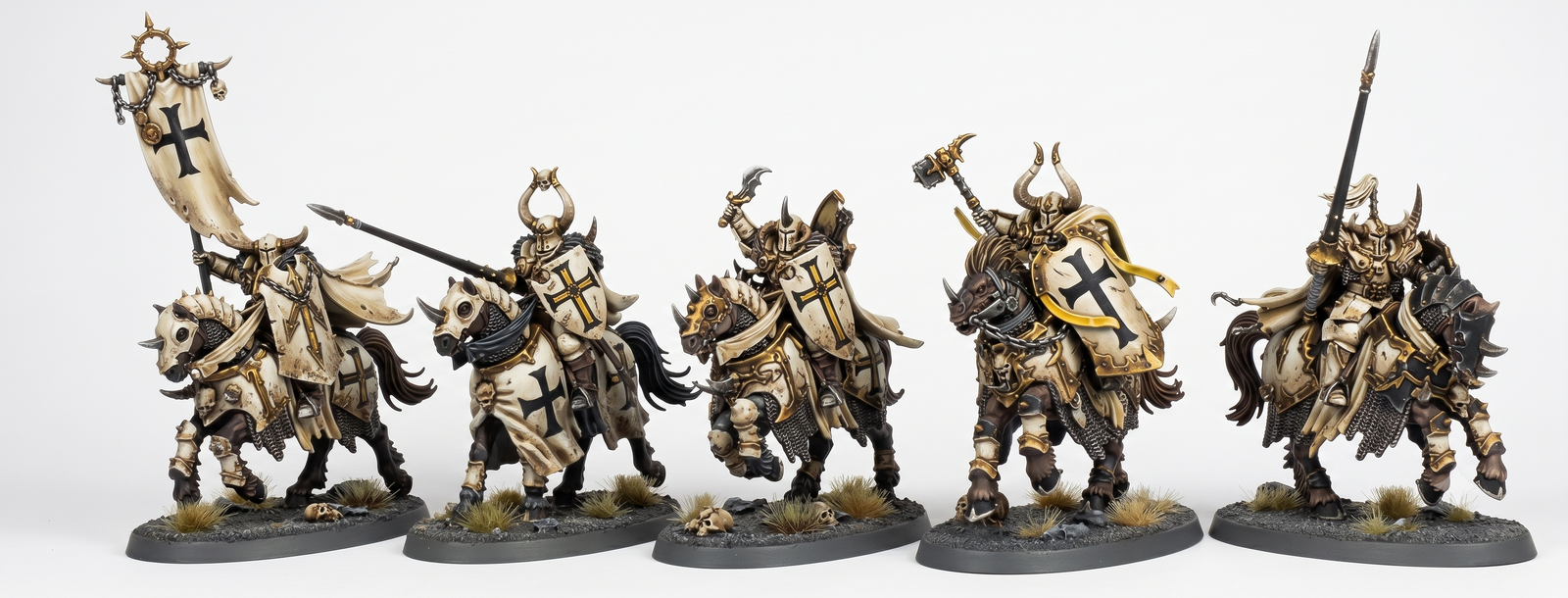
At first glance, though, the biggest talking point was obvious: this looks very Order. End3r was into it right away, and Wilini summed up the main concern perfectly — for him it reads more like Order than Chaos.
And honestly, we get it. The scheme has that clean, disciplined, heraldic feel that usually pushes our brains toward the forces of Order rather than the spikier, more corrupted side of Warhammer. That said, that contrast is also what makes it interesting. Sometimes the coolest Chaos concepts are the ones that don’t go for the most obvious black-metal-and-blood approach.
Michał’s response was also the key to the whole idea: “Teuronic was Order only in name :)”. And that really sells the concept. If the inspiration is something that already plays with the tension between appearance and identity, then a Chaos force wrapped in a more rigid, knightly visual language can work really well.
The other big point from Wilini was practical rather than thematic: if we wanted to do white with a brush instead of an airbrush, it could be absolute suffering. And, well, fair. Clean white armor is one of those hobby choices that looks amazing on a concept image and then immediately starts asking difficult questions once the painting actually begins.
So if we were taking this from concept to miniatures, the main lessons from the chat would be:
- the scheme looks good,
- it risks reading as Order more than Chaos,
- the symbol probably needs to be changed to something more overtly Chaos-y,
- and painting that much white by brush could be a brutal experience.
That symbol change is probably the easiest and most important tweak. Even if the armor stays clean and disciplined, a more corrupted icon, some subtle weathering, or a few sinister details could push the whole thing much more clearly into Chaos territory without losing what makes the scheme stand out.
We really like this kind of discussion because it sits right in the sweet spot between lore vibe and hobby practicality. A paint scheme can look fantastic, but it also has to survive contact with actual paint, actual minis, and our actual patience.
For now, our verdict is simple: great-looking concept, but it needs a stronger Chaos identity if that’s the goal. And if the white is staying, an airbrush might save both the scheme and the painter.